For the past few months I’ve been throwing around the phrase ‘journal aesthetic’ in relation to how Garrison is going to look. I’ve said it so often that it’s starting to feel like a nonsense tech buzzword like ‘disrupt’.
In truth, it’s taken a while for Sophie (artist) and I to land on exactly what this means in relation to the game – which is what I’m going to talk about today.
Before I do that, though, let’s harken back to a few of months ago wherein I joked about a lack of merch and wanting a t-shirt cannon.
I can now proudly present to you the first (and almost certainly last) image of me wearing an item of clothing with our logo on it:
What started out as a silly little joke for this devblog turned into a full-on, torturous product photoshoot. Or at least that’s what it felt like.
Never again.
What’s so great about journals, anyway?
Every devblog I’ve done so far has, in some way or another, included mention of the ‘aesthetic design language’ for Garrison.
I’ve intentionally avoided fully diving into it, although I did give a meaningful glimpse back in September – as well as revealing the first piece of concept art, I also discussed my original idea for the game to quite literally be played within the pages of a journal.
Perhaps most importantly, I also discussed how I wanted this game to feel – as if you are discovering and documenting the world as you play through the story.
I’ve always been attached to the idea of a journal because in my own life I’m constantly making notes and sketches on whatever scrap of paper I can find.
Reflecting on the entire conceptual development process, I’d say we faced two major issues: 1) how do we best translate the feeling we want into something that also works in a fantasy RPG (especially on mobile screens) and 2) I wasn’t really sure exactly what I wanted.
It sounds contradictory… because it is. I knew what I wanted but also I didn’t – when something has lived inside your head for so long, nothing can ever really compare.
Where I kept getting stuck was wanting all of the artwork to look the same, except it was an impossible task because you can’t capture a landscape in the same way you would a monster that was charging towards you with the intention of doing something unpleasant.
I hold my hands up here because it took me a little while to realise the approach I was pushing for was wrong, which undoubtedly made the process unnecessarily frustrating at times.
But then it happened. Sophie figured it out.
I had a discord message. “I really want to show you a book” (or something to that effect). So I jump on a call and immediately there’s an excitement, which naturally means I start getting excited too.
“Have you ever heard of Brian Froud?”
Now I wouldn’t call myself a movie buff but, being a huge fantasy nerd, I had of course seen Labyrinth.
Before I could even answer she’s flicking through the pages of a book called The World of the Dark Crystal. For the uninitiated, it’s a collection of artwork with a lot of world lore woven throughout.
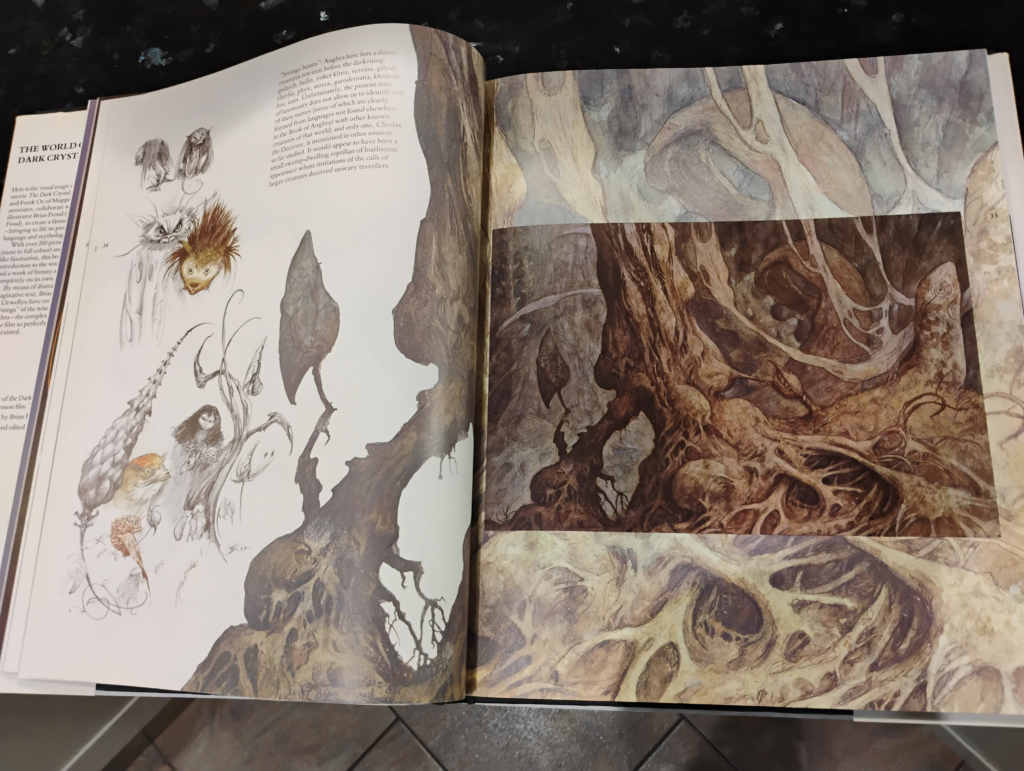
I think Sophie could tell I wasn’t immediately grasping the significance of what she was showing me, so she made it explicitly clear: all the different styles of artwork were unified both by the world they are in and by the artist that created them.
Woah.
To frame the problem differently – I was looking at each individual piece of concept art on it’s own and not considering how they would all exist together in the wider context of the world we’re trying to create.
By taking a step back, I was able to see Sophie’s vision… and it’s going to be glorious.
Community Q & A
This month’s community question comes from a guy called Jake that I started talking to in a Tesco because he was wearing a t-shirt that said “THIS IS HOW I ROLL” above a d20 (a twenty-sided dice for those unfamiliar with Dungeons and Dragons or other board games).
After chatting for a while about how I find inspiration for this world and showing him some of our artwork, he asked:
Do you cover the actual stage-by-stage art creation process anywhere? That’d be pretty cool.
It would be pretty cool, Jake, I agree – so I asked Sophie to talk a little bit about it!
Designing the Attergan Elixir
When designing visual elements of Garrison there are several things that are key to my process.
Firstly, it has to be attractive with well thought out shapes that are both readable, especially at a smaller scale when seen as icons in UI.
Secondly, it must reflect its purpose as a game object, i.e. a rare item should use materials befitting its status, a difficult monster to conquer should look intimidating, a zone environment should be indicative of what you might encounter within, and so on.
Thirdly, they should be designed within the style that has been established, utilising good historical reference but not being a slave to reality.
Initial experimentations
In this instance, the Attergan Elixir removes poison, and in being a type of antidote I wanted it to feature a snake in its design as snakes are not only synonymous with their bites and the antidotes required to treat them, they also provide a level of ornamentation that feels fitting for this rarer class of provision.
Initially I experimented with a design that could incorporate the snakes body twisting to provide a handle, however the design looked unbalanced.
The large head was too top heavy, and the handle would only really be counterbalanced if the body of the container was substantial, which in this instance it could not be as that would put it into the wrong class of more common provisions.
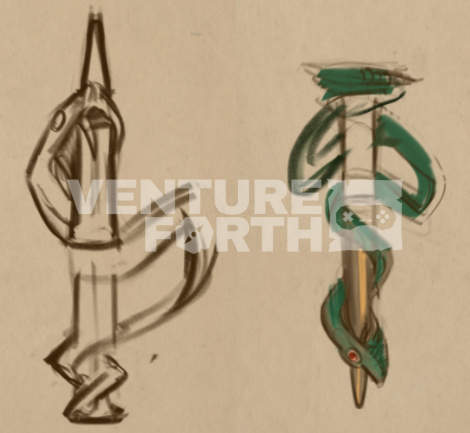
Keeping the initial idea in mind, I tried turning the vessel upside down and used the snake’s body to create a loop on either side. This was so that it could have a chain attached or perhaps enough space for a finger to grasp it.
Design iterations
At this stage iteration began, and the idea of a dagger shape for the vial took root as it felt it would lend some drama to the design.
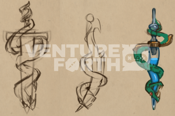
The idea of a curved blade was explored with the intention of adding some asymmetry, but the overall shape with the grip so far to one side seemed like it would obscure the overall impression of this being a container.
Keeping the grip at the centre of the blade, I then toyed with the idea of a blown glass vial in the shape of a Javanese kris type dagger that features a wavy blade that might work nicely with the snake coiling around it, but ultimately felt like it was less readable.
In addition to this, I felt like the snake was too thin and unappealing (above right), but one element that I did like from this design was the crossguard that featured flipped symmetry along the vertical axis as it enhances the coiling design of the snake.
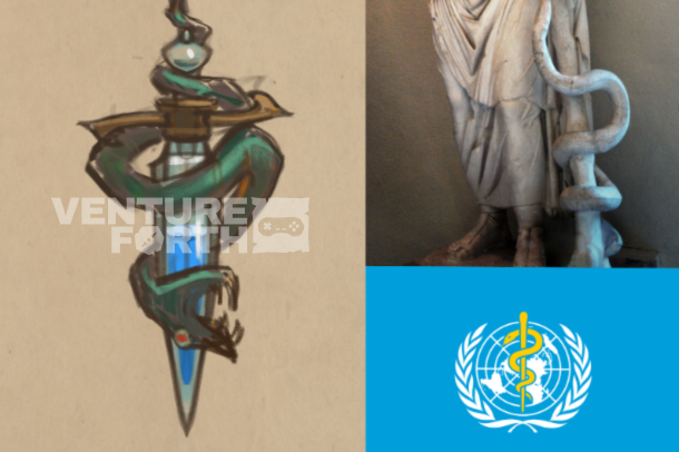
In keeping what wasn’t working in mind, I was then able to create a design that finally did show promise.
This design (above) keeps the asymmetry of the crossguard and the now thicker and more appealing coiling snake, but creates a stronger juxtaposition of shapes with a more obviously blade shaped vial.
It also deliberately begins to use the association of the Rod of Asclepius, a snake entwined around a rod that features on the World Health Organisation’s flag as well as numerous medical institutions worldwide.
Utilising the visual elements that players’ will already have existing associations with can both help add credibility to designs and also help them to understand the purpose of items more immediately.
Obvious fun
This being game art, of course, it’s good to really find the obvious and have fun with it – the snake with its head speared in a state of defeat being more on the nose and aesthetically cool.
Onto the really fun stage! Drawing the item as it will appear in its encyclopaedia entry and icon.

Now that the design has been established, stylisation becomes key.
First, I sketch out some rough line art that I’m happy with, paying attention to how to create a dynamic angle that works in square dimensions, followed by flat colours and a simple value structure to ascertain whether the elements read clearly and independently.
Lastly, I start to add some simple detailing and as with other visual elements in the game I like to use genuine historical reference from the time period.
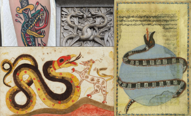
The illustrative interpretations of beasts from this era is crude in anatomical detail but remains both monstrous in its wrongness and yet somehow charming.
The pointed nose, multiple teeth, and ringed round pupil feel important here.
Finalising the design
Now that all the elements are in place I want to make sure the stylisation is really on point and we’re achieving a consistent quality across the images, so I put other items right next to my canvas as reference.
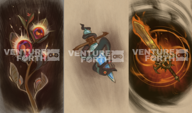
Now that all the elements are in place I make sure to have other finished items as reference next to my canvas so I can bring it up to the same level of detail and create a similar aesthetic – colour palette, choice of brushes, and a technique that focuses on exposing more of the line art than my usual painterly style is something that is working for us in Garrison’s journal aesthetic.
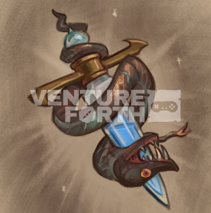
Et voilà! The finished image for our Attergan Elixir antidote provision. Some minor adjustments, such as the adding of a forked tongue and reshaping of the head, in addition to suggestions of oxidised copper material, complete this vial!
Back to me now – massive thank you to Sophie for this insight. I do see glimpses of this when we’re designing something new but never in this much detail.
This is already a long’un so I won’t ramble on any further! My New Year’s resolution is for you to subscribe to the newsletter and check out the discord. See you in 2026!
Cheers, Andrew
